Idaho Falls Magazine Contest Submission

1. Snicker; 10/16/11; 5:29pm; Tautphaus Park, Idaho Falls; f 5.6; 1/100; Canon EOS Digital Rebel XS.

2. Crab Apple; 10/16/11; 5:11pm; Idaho Falls, ID; f 5.6; 1/80; Canon EOS Digital Rebel XS.

3. Weed; 10/16/11; 2:45pm, Rexburg, ID; f 5.6; 1/320; Canon EOS Digital Rebel XS.

All of my photos showcase different aspects of Eastern Idaho. I liked the top photo because it’s a cute, but also because it was taken at Tautphaus park in Idaho Falls. The second one is of crab apples, which can be seen all over Rexburg and Idaho Falls. The last photo is a weed, but it has a flower on it. I like it because it’s very “Idaho” looking, but its still a pretty shot.

I submitted my photos to the Idaho Falls Magazine Contest Submission because I felt that these photos all showcased Eastern Idaho, and the beauty that is seen here. I also felt that they met the qualifications for the contest pretty well.

Here is the link to the contest: http://www.idahofallsmagazine.com/gallery/contest.cfm

I submitted my entries on 11-29-11.


Poster Print

Original: 

Rustic Piano; 10-20-2011; 2:37pm; Bannock, MT; Aperture Priority; f 5.6; 1/8; Canon EOS Digital Rebel XS.

I printed on 24×36 of this image.

I did a lot of edits to make this picture what I wanted it to be. The first thing I did was the spot healing brush to cover up some of the dust and blemishes on the keys. I then did a new adjustment layer, but I had only the area around the keys selected. I then brought up the contrast, brightness, and saturation. I then selected only the top portion of the image, and did the same thing. Then, I added an unsharp mask to the whole image, and then did a lens correction to add the vignette.

I had a really hard time choosing a photo to print. I have a lot of images that I really like, but that I didn’t necessarily want blown up on my wall. The only place in my apartment with an area big enough to put a 24×36 is above my kitchen table, so I also wanted it to somewhat match the room. I had some other images picked out, because I thought this one would be too blurry blown up, but I decided I didn’t want those ones blown up. I play the piano, so this image sort of represents me. I figured its something I could have for a while and always find a use for, so I spent some time doing some edits, and then printed this one. I’m really pleased with how it turned out.

I took this picture in one of the houses in Bannock Ghost town. The house had tons of really cool things in it, so I was just going around and taking pictures of all of them. I didn’t really have a process, but I new I wanted a picture of the keys on the piano.

As you can see, the original is kind of boring. It looks flat, and there isn’t really any cool colors or aspects to it. It also looks really old and dusty. That is why I did I adjusted the contrast, brightness, and saturation because they all added flavor to the image. I sharpened it so that it would be less blurry, and to crispen the edges. I added the vignette to add more depth to the image.

Fine Art Template

Original:

1. Crab Apple; 10-16-2011; 5:11pm; Idaho Falls, ID; f 5.6; 1/80; Canon EOS Digital Rebel XS.

For this image, I brought up the saturation and contrast in new adjustment layers. I resized the photo so that it was big enough for the other image.  I then did the clipping mask on top of my three squares, and then added my signature on the bottom.

Original:2. Pound Cake; 10-16-11; 3:26pm; Rexburg, ID; f 5.6; 1/50; Canon EOS Digital Rebel XS.

For this image, I brought up the brightness and contrast. In my new imaged, I added the squares and then merged the layers. Back on my image, I resized the photo so that it was actually bigger than the template, and then posted it and created a clipping mask. I really liked this assignment!


Night & Light

Original:

1. Cars; 11-6-11; 7:07pm; Idaho Falls, ID; f 20; 130/10; Canon EOS Digital Rebel XS.

For this image, I sat on the side of the road in IF because I don’t have a tripod. I like the effect it had though, because the cars lights were above me, so they showed up at the top of the photo. I added an adjustment layer and took the contrast way up to kind of hide the extra things and not the lights.

2. Fire Jar; 11-6-11; 10:21pm; Rexburg, ID; f 20; 100/10; Canon EOS Digital Rebel XS.

I didn’t do any edits to this photo. I lit a paper towel on fire, and placed it in a glass jar, and then took a couple different photos. This one was my favorite.

Original:

3. Dot Game; 11-6-11; 10:43pm; Rexburg, ID; f 20; 200/10; Canon EOS Digital Rebel XS.

For this image, my husband held a flash light, and then a smaller flash light. With the bigger one, he turned it on and off to make the dots, but left the smaller one on to make the lines so that it gave the appearance of the dot game. I cropped the photo so that there wasn’t as much blank space, but I didn’t do any edits.

Original:

4. Flame; 11-6-11; 10:39pm; Rexburg, ID; f 20; 100/10; Canon EOS Digital Rebel XS.

For this image, my husband held a lighter, and then sprayed his body spray on it to make the flames. Yes we did it in our apartment, and yes it smelled awful. I brought the contrast up to make the background less distracting.

Original:

5. Graffiti; 11-6-11; 10:32pm; Rexburg, ID; f 10; 100/10; Canon EOS Digital Rebel XS.

For this image, we just used a flash light and painted random things in front of the camera. I liked the graffiti affect it had. I brought the contrast up to make the light more defined, and the background less distracting.

Original:

6. Blurred Lights; 11-6-11; 7:14pm; Idaho Falls, ID; f 20; 300/10; Canon EOS Digital Rebel XS.

For this image, I was near a road in IF. I took the photo, and then focused on cars, stop lights, signs, etc and kept moving the camera around for the length of the shutter being open. I like this shot because although the light is blurred, it looks like it still has some order to it. I brought the contrast up on this image.

Original:

7. Attack; 11-6-11; 10:34pm; f 20; 200/10; Canon EOS Digital Rebel XS.

For this image, I had my husband look scared, or try to, and then I tried to paint it like something was coming to attack him. I did a light painting around him to make him stand out, and then in Photoshop, I darkened the background with an adjustment layer, and then painted over that layer with black on my husband so that he still showed up.

Original:

8. Woody; 11-6-11; 10:33pm; Rexburg, ID; f 20; 100/10; Canon EOS Digital Rebel XS.

For this image, my husband took a flashlight and spelled his name. In photoshop, I brought the contrast up and also the color saturation.

Original:9. Swirl, 11-6-11; 10:33pm; 100/10; Canon EOS Digital Rebel XS.

For this image, my husband drew a swirl while the shutter was open. I brought the contrast up in photoshop to make the background more plain.

I had a lot of fun doing these light shots! I love how they turned out too!
Scanography


Originals: 

1. 4911; 10-30-2011; Rexburg, ID; Epson 4180 Scanner.
I used the scan of the picture frame as the basis for the rest of them. The scanner must have been dirty, because there was spots all over all the images, so I went through with a black brush and a  56% opacity to kind of clean things up. I then merged in the other images in new layers, and formatted them how I wanted. I brought the opacity down on the marriage license so that it wasn’t so bright, and then I added the date that we got married with text.
Original: 
2. Spices; 10-30-2011; Rexburg, ID; Epson 4180 scanner.
For this image, I unloaded my spice rack onto the scanner. I brought up the contrast in the image a little bit, and then added the text for good measure. Other than that, I didn’t do any other edits. I really like how this turned out though!

Edge Edits

Original:

1. Grass; 10-20-2011; 12:26pm; Bannock, Montana; f 5.6; 1/400; Canon EOS Digitial Rebel XS.

For this image, I first brought up the contrast and saturation. I then added one of the artistic filters. I saved it as a jpeg, and then reopened it to use the history brush and add the painted on effect. I used brush 2,3, and 5, and then added a border around the outside. I also had added some extra canvas space too. I used tutorial #10 for this.

Original:

2. Crepe; 10-29-2011; 11:46am; Rexburg, ID; f 5.6; 1/320; Canon EOS Digital Rebel XS.

For this image, I first brought up the contrast and saturation. I then used tutorial #12 to do the double fade border. It took me a while to do it because I didn’t fully understand the tutorial, but once I figured it out, it was really cool! I then added the text, just for a fun effect.

Original:

3. Crab Apple; 10-16-2011; 5:11pm; Idaho Falls, ID; f 5.6; 1/80; Canon EOS Digital Rebel XS.

For this image, I used tutorial #13 for the Burned Border. I brought out the contrast and saturation before doing the border. I copied the layer twice so that the colors would be more vibrant, and then did the steps in the tutorial.

Best of Bannock

Original:

1. Pork Sausage; 10-20-2011; 2:31pm; Bannock Ghost Town; f 5.6; 1/6; Canon EOS Digital Rebel XS.

I used the tone mapping in Photomatix on this image, but then brought the hue saturation down way low so that the image was black and white with just a few bits of color showing through. I also brought up the contrast to give more emphasis to the photo subject.

Original:

2. Chair; 10-20-2011; 2:41pm; Bannock Ghost Town; f 5.6; 1/64; Canon EOS Digital Rebel XS.

I used the tone mapping in Photomatix for this image, which gave it a more rustic appeal. I brought the contrast down, and the saturation up to give it better colors. I love the color of this chair.

Original:

3. Bottled Love; 10-20-2011; 2:39pm; Bannock Ghost Town; f 5.6; 1/320; Canon EOS Digital Rebel XS.

I brought up the saturation quite a bit in a new adjustment layer. I also added some more contrast in an adjustment layer. I really love this image because the bottle was sort of blue-ish, and so it looked cool with the blue curtains behind it.

Original:

4. Man & Woman; 10-20-2011; 5:36pm; Bannock Ghost Town; f 5.6; 1/160; Canon EOS Digital Rebel XS.

I changed this image to black and white by desaturating it. I Then brought up the contrast quite a bit to make the black a darker color.

Original:5. Piano; 10-20-2011; 2:37pm; Bannock Ghost Town; f 5.6; 1/8; Canon EOS Digital Rebel XS.

I brought up the saturation in this image in a new adjustment layer. I also brought up the contrast, and the “Black” color in camera raw. I wanted the camera to have a bolder appeal.

Original:

6. Iron Heart; 10-20-2011; 2:15pm; Bannock Ghost Town; f 5.6; 1/20; Canon EOS Digital Rebel XS.

I added a “color balance” adjustment layer, and then adjusted the hues until it was the tone of sepia that I wanted. I wanted a brighter sort of aged look, so I made it kind of yellowish. I then added a contrast adjustment layer, and used that to make the image a bit darker.

Bannock Light Painting

1. Hat; 10-20-2011; 7:25pm; Bannock Ghost Town; f 8; 150/10; Canon EOS Digital Rebel XS.

I didn’t do any edits to this image, but I did use a long shutter speed, and got the lighting effect from a flash light shining all over the hat and chair while I waited for the picture to take.

Original:

2. Hotel Meade; 10-20-2011; 7:01pm; f 22; 60/10; Canon EOS Digital Rebel XS.

I brought up the contrast and saturation in new adjustment layers. I also used a tripod and a long shutter speed, as well as the light from some spotlights to create this image.


Bannock HDR

Three images:
1. Shop; 10-20-2011; 1:09pm; Bannock Ghost Town; f 5.6; 1/4000; Canon EOS Digital Rebel XS.

For this image, I used the “Deep Compressor,” in Photomatix, and then adjusted the levels a bit. I then opened the image in Photoshop to get rid of the person on the left side of the image.

Three images:

2. River; 10-20-2011; 1:16pm; Bannock Ghost Town; f 5.6; 1/2000; Canon EOS Digital Rebel XS.

For this image, I edited it in Photomatix, and adjusted the levels to make it less intense. I then resized it, and uploaded.

One-Shot HDR:

Original:

3. Doorknob; 10-20-2011; 12:19pm; Bannock Ghost Town; f 5.6; 1/30; Canon EOS Digital Rebel XS.

I didn’t do any edits to this image except in Photomatix. I used the compressor default effect to make it look like it does, and then brought up the black point to make it a tad bit darker. I thought it was really cool how just a simple edit could make the picture look so much better.

Bannock Macro Abstract


Originals:

1. Tile; 10-20-2011; 2:33pm; Bannock Ghost Town; f 5.6; 1/125; Canon EOS Digital Rebel XS.

(info same as below)

Blended Image:

2. No. 51; 10-20-2011; 2:33pm; Bannock Ghost Town; f 5.6; 1/60; Canon EOS Digital Rebel XS.

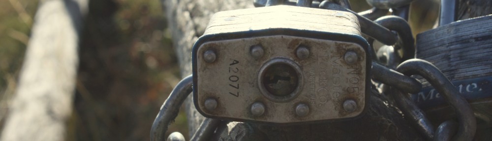
On the overlay image, I brought up the contrast before transferring it. On the No. 51 image, I brought up the saturation and contrast in new adjustment layers. I then transferred the overlay image to the No. 51 image, and switched the layer to “Overlay.” I then brought the opacity down.